
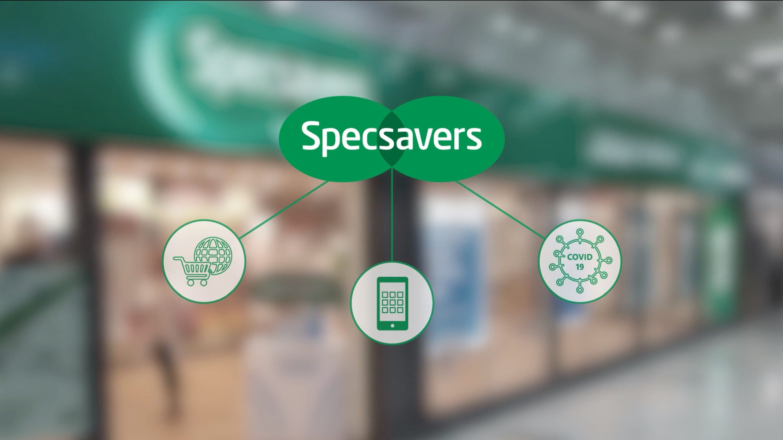
Specsavers
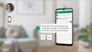
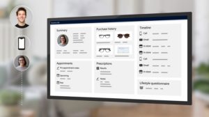
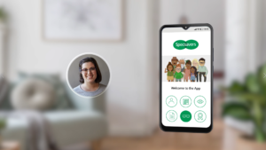
This is a good example of mixing graphics with software and bringing the focus screen to the forefront to provide separation and emphasis. It keeps the viewer’s attention in the right place.
We’d like to share this movie with you, but it’s only just been completed and is awaiting approval.
Unilever
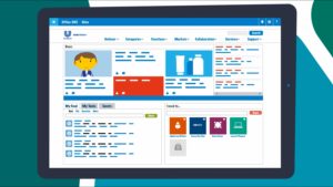
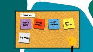
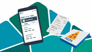
This is different type of animation and also a different approach to promote an intranet. The content is snappy and visually contextual e.g. the notes on a cork notice board float onto the user’s personalised home screen. This was for the 100,000 users at Unilever and has many similarities to the information you want to get across about Unily, so it’s worth the two minute investment to watch it.
AnalogFolk - Marmite
We’ve included this video simply because it uses quirky graphics to create a more fun customer story. Not necessarily relevant to the current project but certainly something that would work for Unily’s fresh approach and so something to consider for future stories.

Dynamics Banking Promo
IGNORE THE FIRST SECTION OF THIS VIDEO – THE WEB CHAT AND JUMP TO 0.58. This is an alternative approach to looking around the Unily UX. By adopting this style you would be able to put users and context (from libraries) into the messaging and relate more directly. It’s a snappy delivery style so would suit a fast moving narrative.
